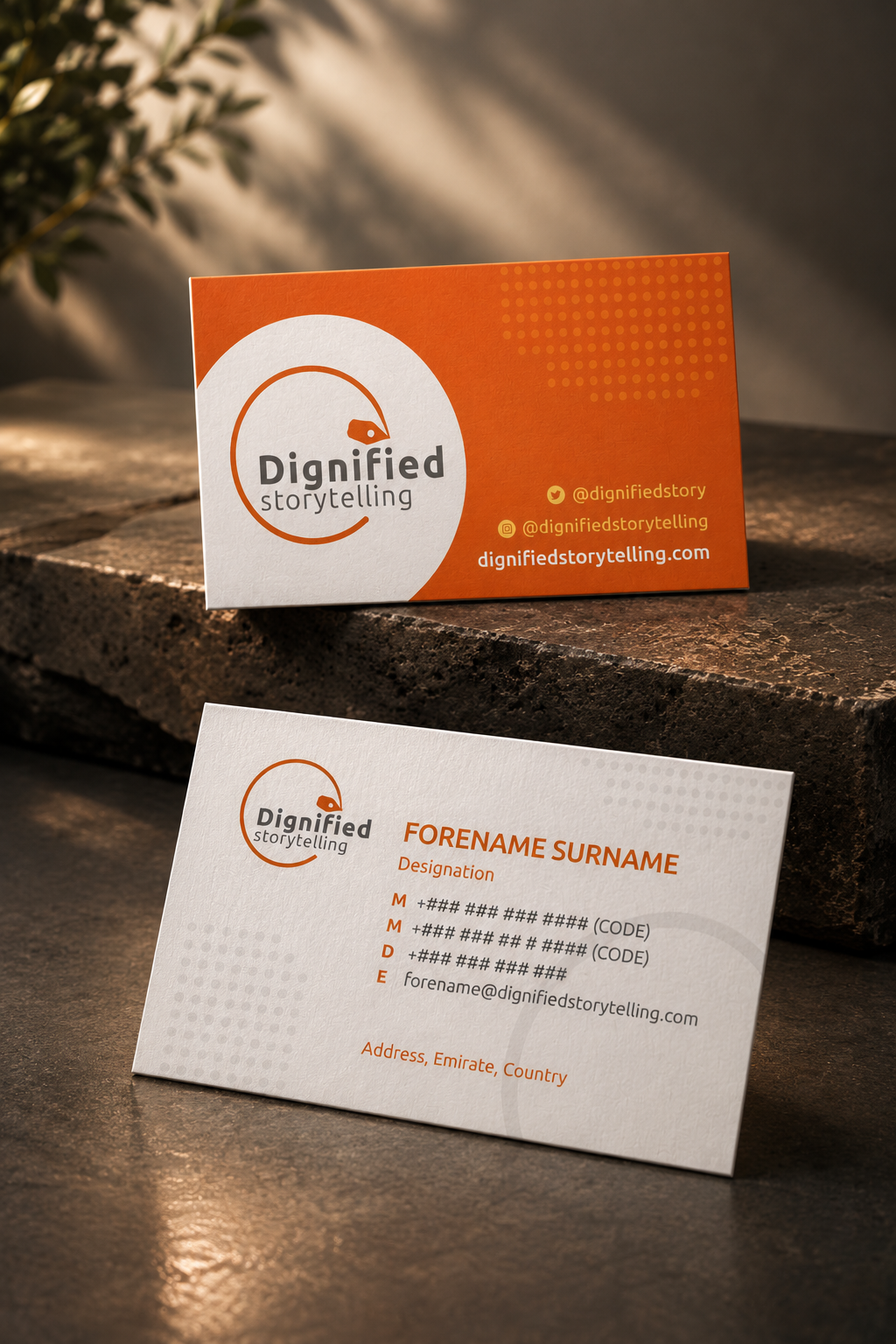
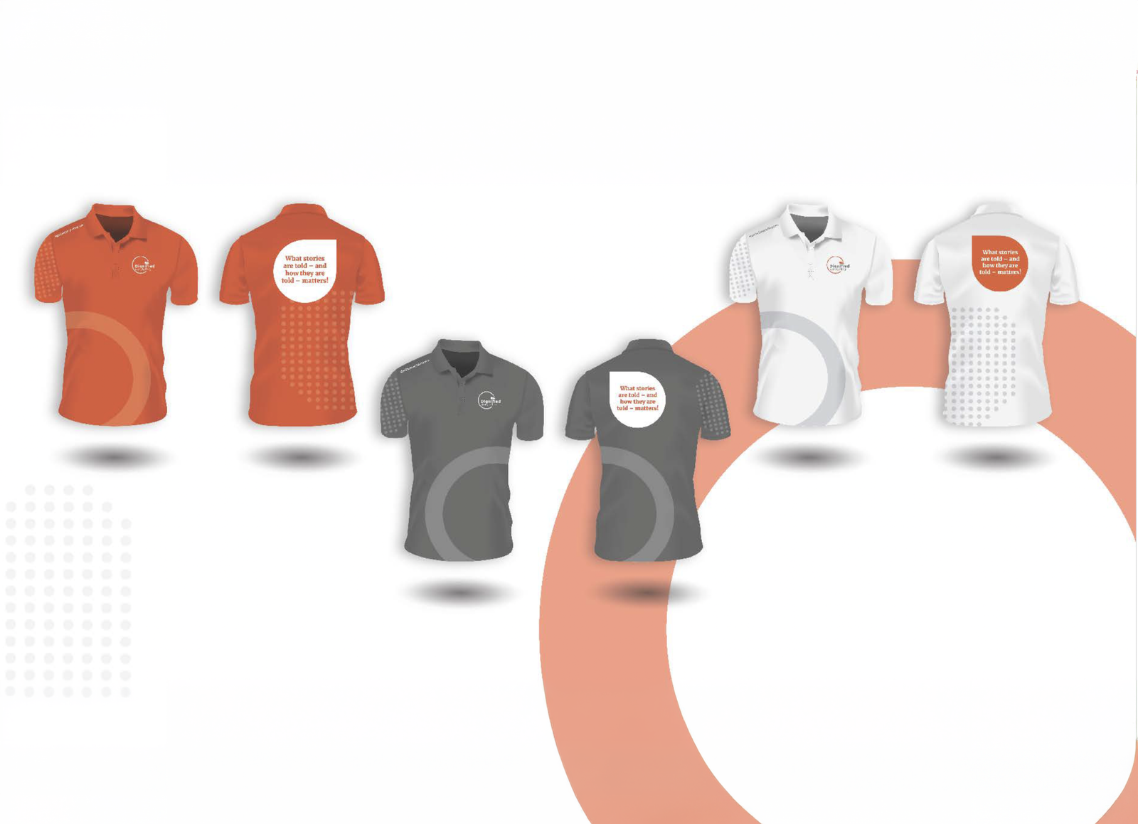
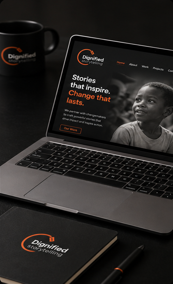
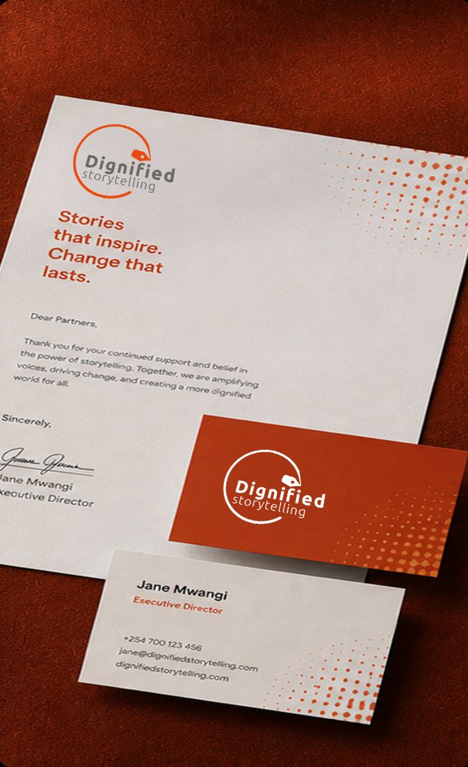
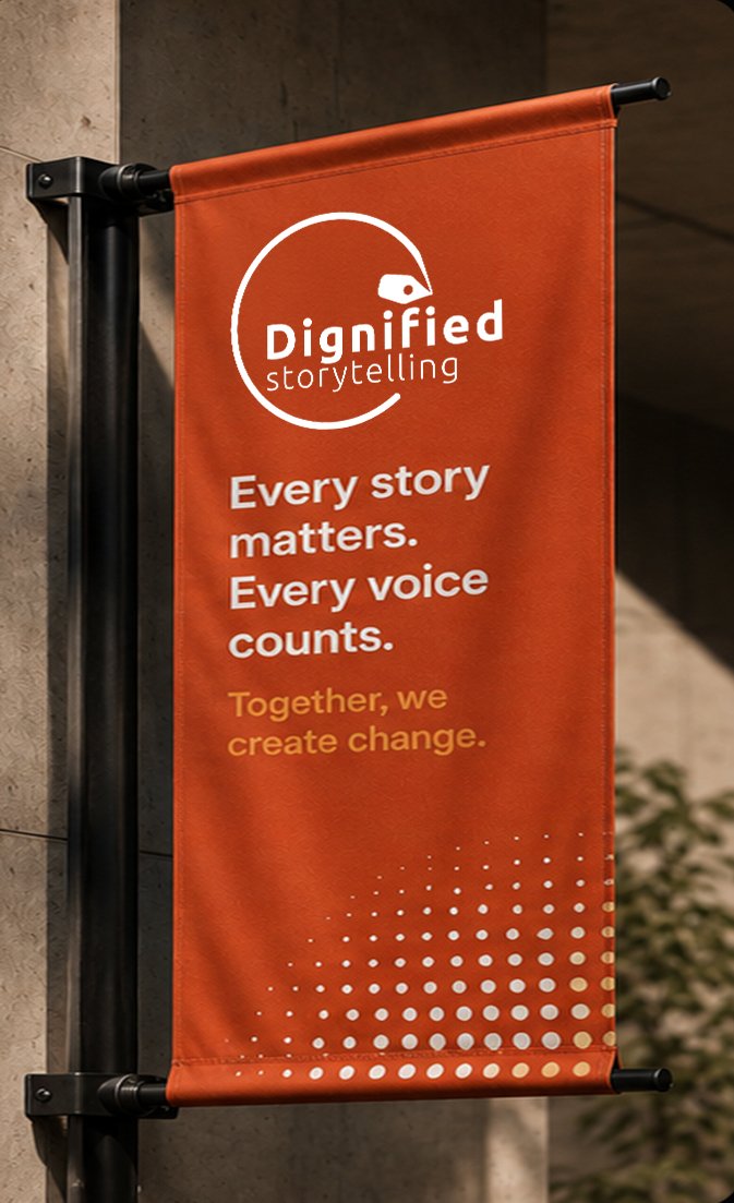
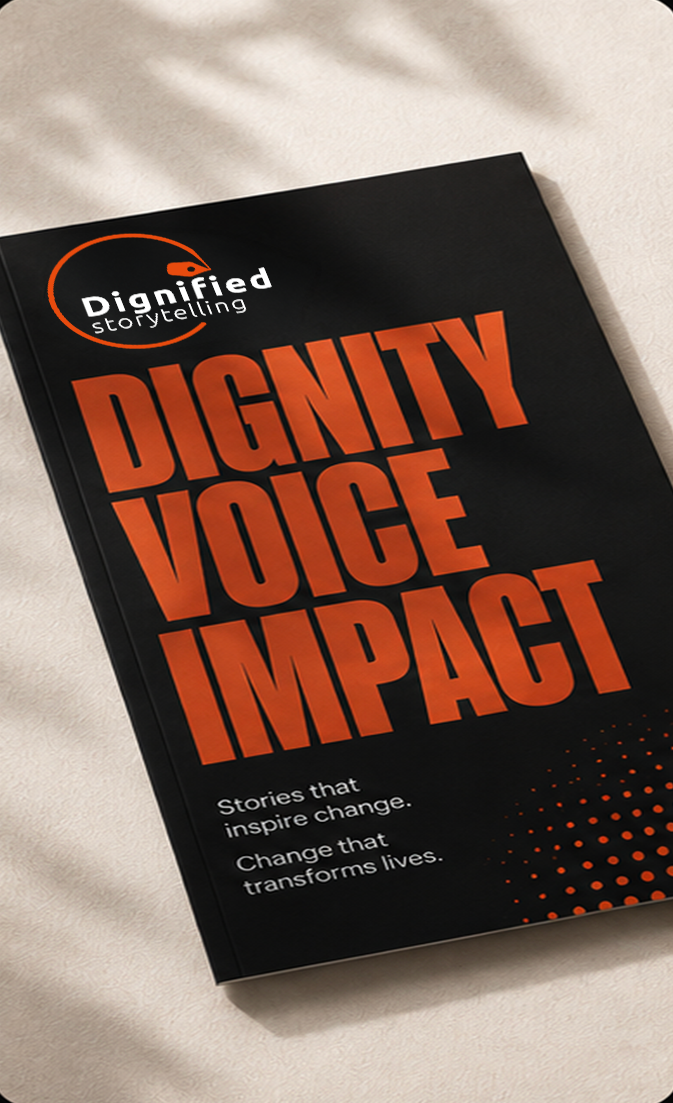
The resulting identity establishes a recognizable, vibrant, and human-centred visual language for Dignified Storytelling. A distinctive circular storytelling mark, bold orange-led colour palette, approachable typography, people-centric photography, and flexible graphic elements work together to create a cohesive brand experience.
The system was developed to extend naturally across multiple touchpoints, including websites, presentations, social media, advertising, stationery, apparel, and campaign materials, while maintaining a consistent and meaningful connection to the initiative's core principles.
The visual direction prioritizes candid, realistic, colourful, emotion-evoking and people-centric imagery, reinforcing the human stories behind the initiative while avoiding overly staged or corporate communication.